For this project, the client wanted a logo that represents ki (Japanese for chi) an energy force that flows in everything. The client’s idea was to create a brand the reflected his values for community and outreach.
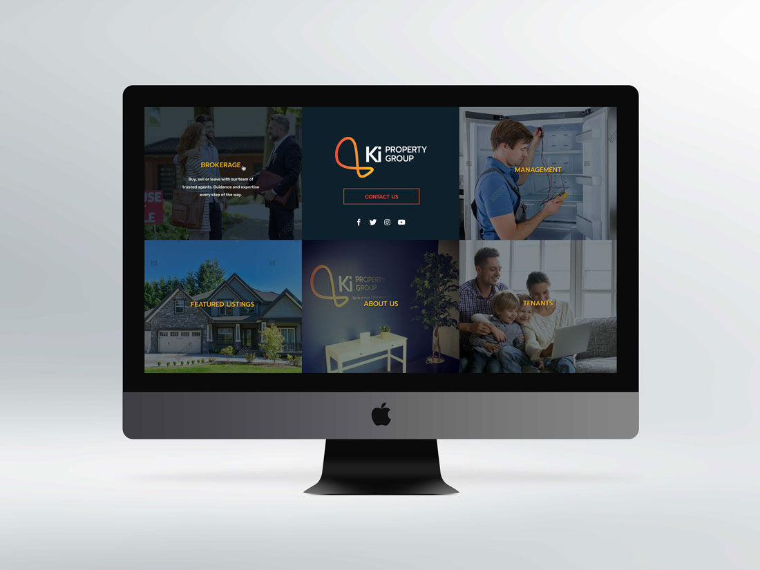
The web design was made to be simple to access so the users would have no problems navigating the site.
Check out the project on 3-prime.com


